

CASE STUDY
A 40+ Year Legacy, Rebranded for What’s Next
Client · United Services Group
CEO · Michael Kroupa
Industry · Commercial Facility Services
Scope · Brand Strategy, Brand Identity, Web Design, Brand Management, Marketing
Growth Snapshot
A long-standing family business with a new visual identity for its next generation.
40+ Years in Business
The company had been operating with essentially the same logo, marketing materials, and visual approach for three decades.
30 Years Without a Brand Refresh
A fragmented visual presence was consolidated into one recognizable, scalable brand system.
4–5 Logos → 1 Cohesive Identity
New Customers, Industries & Direction.
Post-rebrand, United began attracting new types of business, including customers and industries they hadn't previously served.
Context & Challenge
United Services Group had been in business for more than 40 years, but its brand hadn't evolved with the company.
For nearly 30 years, United had used essentially the same logo, marketing materials, and visual identity. By the time Michael Kroupa was taking over from his father, the company was using 4–5 different logos, creating an inconsistent and dated brand experience.
The bigger problem? The brand made United look like a cleaning company—and potentially an outdated one—when the business had evolved into a much broader commercial services provider.
Michael wanted to put his own stamp on the next generation of the family business while preserving the legacy his father had built.

“The rebrand gave the company a new path. It gave us a new direction on where we can go.”
MICHAEL KROUPA | CEO, UNITED SERVICES GROUP

The Brand Had Outgrown the Logo
United wasn't just cleaning anymore.
The company had expanded into landscaping, snow removal, janitorial services, handyman services, and other commercial facility solutions—but the old identity didn't communicate that.
Externally, prospective customers were sometimes confused about who United was and what they offered.
Internally, the fragmented identity reflected that same lack of clarity.
The business had evolved. The brand hadn't.
The goal was to create an identity that felt established and credible—but also modern, unified, and ready for growth.
the Human Part of the Rebrand
This was a family business. The emotional stakes were real.
Michael wanted to create something that represented his vision—but also something his father could be proud of.
The challenge was to honour the legacy without being trapped by it.
That meant understanding the people behind the business before designing the identity.
Michael said the process made him feel heard and gave him confidence that the final brand represented where United wanted to go.
“It wasn't just getting a new logo and throwing it out there.”

Brand Strategy
This wasn't about designing a new logo and calling it a day.
We used the rebrand to define who United was, where the company was going, and how the next generation could build on its legacy.
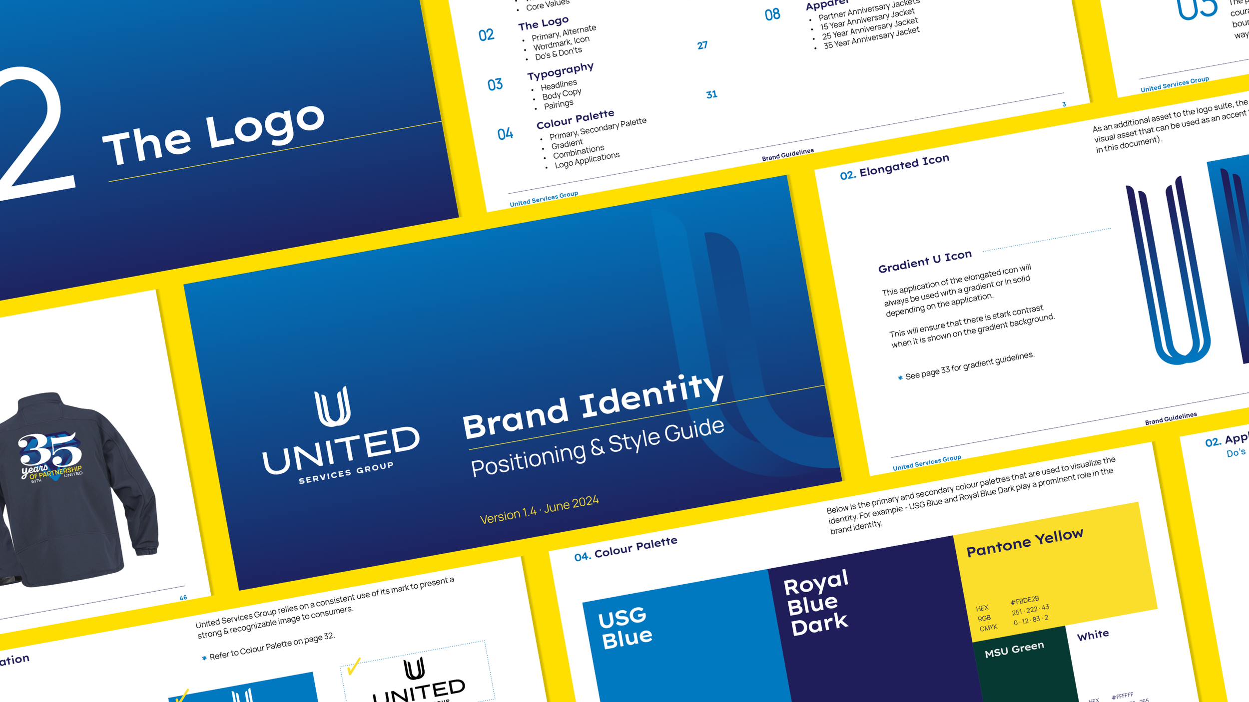
Through strategic conversations, mood boards, positioning, and visual development, we translated the company's history and Michael's vision into a cohesive brand system.
The result was a brand that felt:
Established
Professional
Modern
Confident
Unified
Built for growth
For Michael, the process also changed how he understood branding itself. What had once been “just a logo” became a strategic tool for communicating the business.

Results
40+ years of history.
30 years of visual stagnation.
4–5 logos consolidated into one cohesive identity.
1 new generation of leadership.
A brand built for what comes next.
And according to United's CEO, the biggest thing the project delivered wasn't a new logo. It was a new direction.
Business Impact
Following launch, Baked in Boujie experienced:
Increased order volume
Better customer understanding
Stronger word-of-mouth referrals
Positive feedback on the professionalism of the brand
Adina shared: “The order form changed everything. I have way more orders now than when it was just DMs.”
And beyond functionality: “It made the brand feel more bougie, more polished, and more professional.”
Key Takeaways
Legacy doesn't have to mean outdated.
Established businesses can honour their history while still evolving their identity.
A rebrand can change perception.
When the business has evolved but the brand hasn't, the visual identity can become a barrier to growth.
Consistency builds confidence.
One cohesive brand system creates a stronger, more recognizable experience for customers and employees.
The right process creates clarity.
Strategic branding isn't about choosing a prettier logo. It's about understanding the business deeply enough to create an identity that actually represents it.
A strong brand creates room to grow.
United's new identity gave the company a foundation to pursue customers and industries beyond its traditional market.